The Recitation Gap: Quranic Transliteration Engine & Three-Tier Rendering Pipeline
How we built Quranic transliteration and a deterministic Three-Tier rendering stack without compromising Correctness-First.
When a creator shares a verse of the Quran, they are usually sharing it for the meaning. They want the translation to anchor the visual and provide a moment of reflection.
But there is a second, equally important intent: recitation. A massive portion of the global audience cannot read Uthmani Arabic script fluently. When they see a verse, they want to pronounce it, not just read the English meaning.
To bridge this "Recitation Gap," we needed to introduce transliteration to AyatFlow. But stacking three different languages on a single canvas is a typographic minefield. This is how we engineered the Three-Tier Stack without breaking our Correctness-First philosophy.
The Data Constraint: Rejecting ASCII
Our first attempt at adding transliteration failed our internal quality checks immediately.
We pulled a standard dataset from a verified API, but the output was a relic of the early web: it relied on legacy ASCII workarounds. It used "AA" to represent the letter 'Ayn (baAAeed) and "oo" instead of standard long vowels (kafaroo instead of kafarū). It smashed prepositions into verbs.
For a platform built on institutional trust, this was unacceptable. It looked like a casual text message, not an academic tool.
We threw the dataset out. Instead, we re-engineered the data pipeline to query a programmatic, word-by-word array. By extracting and dynamically stitching transliteration for each individual word, we moved to DIN 31635-compatible Unicode output.
The pipeline applies three deterministic steps: fetch word-level tokens, normalize transliteration characters into Unicode forms, and rejoin tokens with boundary-aware spacing. The result is macron-accurate output for supported verses (e.g., Wa qad kafarū bihi min qablu, wa yaqdhifūna bil-ghaybi min makānin baʿīd.), without ASCII-era artifacts like AA and oo.
The Visual Hierarchy: Preventing the "Wall of Text"
Once we had reliable data, we had to render it. The danger of stacking Arabic, Latin transliteration, and English translation is that it quickly devolves into a dense, unreadable wall of text.
To preserve the minimalist, Anti-Canvas aesthetic, we had to enforce a strict visual hierarchy. We separated the typographic payload into three distinct textures:
- The Hero (Arabic): Rendered in pure black, massive scale, using a traditional Naskh/Amiri font. It commands the canvas.
- The Bridge (Transliteration): This layer needed to pass the "Macron Test" - the font had to natively support extended Latin characters (
ā, ī, ū, ḥ) without glyph fallback or clipping. We chose a clean, geometric sans-serif and shifted the color to a muted slate gray, keeping it legible but secondary. - The Anchor (Translation): Rendered in a dark gray, italicized serif. It grounds the bottom of the artifact and visually separates English meaning from phonetic pronunciation.
The Smart Engine
AyatFlow is a deterministic engine, not a drag-and-drop editor. The user should not have to manually resize text boxes just because they added a new layer of information.
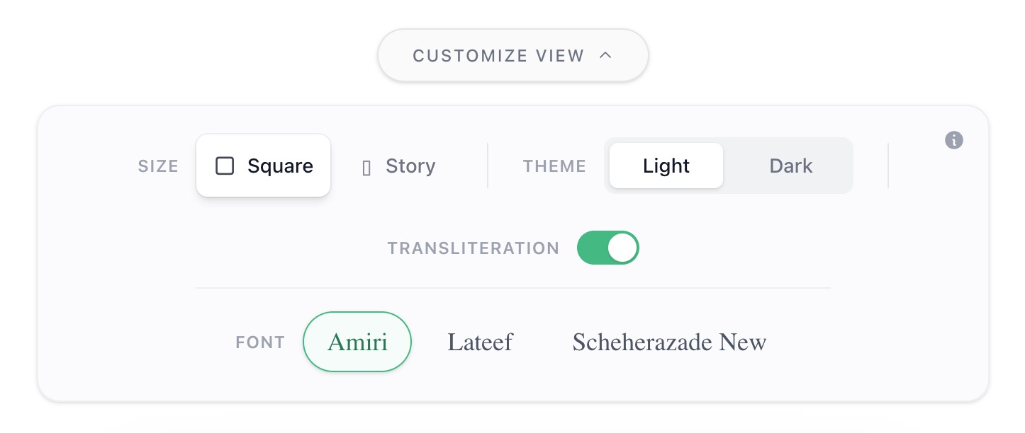
We built state-awareness directly into the Go rendering pipeline. When a creator toggles Transliteration "on" in the UI, the engine recalculates layout constraints immediately. In the current preset, it scales Arabic down by two points to preserve breathing room, inserts the transliteration line in the middle tier, and rebalances vertical spacing to keep the stack aligned.
No dragging. No manual nudging. Deterministic typography, generated in milliseconds.
By treating transliteration not as an add-on but as a first-class engineering and design problem, we closed the recitation gap while keeping readability and typographic restraint intact.
2026.03.26